Wednesday, March 19, 2014

Caring for your Copics!


Hello Everyone and welcome back to another Copic Oz Tutorial!  How much do you love your Copics?  If you are anything like me, they are precious, carefully stored and NO-ONE in my family is allowed to touch them except by special invitation and under careful supervision!  :) 

Today I'm going to talk about looking after your Copics, because like me, you've invested a lot into your collection and if you give them a little love, they will love you back forever!  :)

How exciting is it when you get that brand new, just opened Copic Marker?  It's so clean and shiny, inside and out!


Soon, you're using it all the time, lids going on and off and your busy creating.  One day you look down at your once clean and shiny marker and it looks like this...... Poor G28!  :(


Hmmmm.....time for a clean!  So, what is the best way to clean your Copics?  Well, there are a few different products you can use, just remember to keep away from touching your nibs and focus on the barrel and lid.

Here I'm using a cotton tip dipped in Copic Colourless Blender to clean the barrel....


And the lid.... Eeeek!  Look at how much is coming out of that lid!!

You don't have to use Colourless Blender solution though!  Any alcohol based product will also work, such a Isopropyl Alcohol (Rubbing Alcohol) and even hand sanitiser!


Another  product I came across is alcohol wipes, like the type used to clean glasses!  I can thank my Dad for giving me a hand full of these to clean my sunglasses.....until I realised they smelt of alcohol and now they live in my craft room!  :)  Just remember to stay away from the nibs so as not to damage them!


You can also add some rubbing alcohol to a tissue to clean the barrels and lids, just keep away from the nibs.  Once you've given your poor neglected marker a make over, it will look just like new!  Hard to believe it's the same one as above isn't it!  :)


It's important to look after your nibs and know that you should stay away from some products if you are using Copics........the ones below should never be coloured over with Copics.

Things that are not friends with you markers are.......
1. White Out or Opaque White
2. Un-fired Clay
3. Acrylic Paints (or paint pens such as Molotow)
4. Chalks or Oil Pastels
5. Untested inks or pens
6. Solvents or oils (such as Stazon, a solvent ink)
7. Pencil - won't damage it, but will discolour your nibs
8. Coloured Embossing Powders (this includes opaque white, gold and silver)

I know there is a trend at the moment to stamp and image, emboss it with white embossing power and colour over the top with your Copics.  If you do this, please remember that there is a pigment in Coloured Embossing Powders (clear is OK!) that can clog and damage your nib!  You may find a white patch appears on your nib and you can't get it off even if the ink is still flowing through the nib. This is the EP melting into your nib and eventually the whole nib will clog - much like a small blockage in an artery will one day become so bad that a repair is needed. 

A general rule is if the product smears when it gets wet and is opaque, STAY AWAY!  If you must colour over something like this, airbrush it instead.

Of course, Mixed Media is hugely popular right now and if you want to use Copics you can!  Just do your Copic work first and then your other media types after!

We are sometimes asked about Watercolours......  Watercolours are so thin they generally won't cause a problem, however, they may discolour the nibs.  If you want to use watercolours with your Copics, you can and we suggest using them after you use your makers!
 
Perhaps you've been reading through this and realised that perhaps your nibs aren't as healthy as they should be!  Thankfully when good nibs go bad, there is a quick fix!

If it is just a case of a lid being left off and one nib has dried out, remove the nib and let it soak in a few drops of blender to 'clean the pores' so to speak.  Make sure the blender solution has evaporated before you place it back in your marker and it should be good as new!

What if it's dried out beyond a quick cleanse or you have solvent ink or something nasty on your nib?  Copic sell replacement nibs and it is as easy as removing the old nib from your maker, by carefully pulling it out and replacing with a new one!


Remember, love your Copics and they will love you!!  Hope you've enjoyed today tutorial!!

Happy colouring!!  :)
Pin It

Wednesday, February 19, 2014

Colouring CandiBeans


Hello Everyone!!  Welcome to another Copic Oz tutorial!  Today I'm using a sweet CandiBean image by Little Darlings Rubber Stamps called Izzy's Bumblebee and thought we'd take a look at colouring her using basic colouring taught in the Standard Certification Class and then stepping it up to use techniques from Intermediate Certification.  (If you want to know more about Certification Classes in Australia, you can find all the details HERE!)  X-press Graph-x is now a distributor for the CandiBean range and you can contact them to find a stockist in your area!

Here is Izzy stamped in Memento Tuxedo Black onto X-press It Blending Card.  With Standard Colouring, we teach you to find a colour you like and then a 'friend' to go with in.  Usually this means, find a colour, look at the number and then find another marker with the Same Letter, Same First Number and the Second Number 2 - 4 digits apart.  Always start with your LIGHTEST colour!  Here I've used E000 and E01 for her skin.

For her hair I've used YR21 and YR23 (a colour 2 digits away from the original colour)

Once again, using two colours, E23 and E25.

Continue colouring using pairs of markers to complete your image and she'll look a little something like this.....
Other colours used here are....
Dress - R81, R83; Y11, Y15
Flowers - V20, V22
Greenery - YG03, YG63
Vase - B0000; Y21, Y26

Now she's looking lovely, but what if you wanted to step it up a bit??  Why not take your image and place a piece of acetate over the top with diagonal lines drawn on it.  Imagine this is your light source.  Where the lines hit first (on the image) will be where your highlights are (also imagine that she's not flat, so it will hit the rounded parts of her hat and dress too).  The areas further away will be in the shadow and therefore darker.


Using this template as a guide, start colouring your image! I've begun with her hat using E21
 And E23
 And E25
 And E27
 And for even darker shading, E79.  The more contrast, the more interest and dynamic your image will be!

Next start on her hair!  I've started with YR23.

And E99 (Colouring hair is perfect for breaking the colour rules and mixing colour families and numbers since hair is made up of so many colours!)
Add some E18
And E39

Now lets look at skin, remember that we are imaging that our light source is coming from the top right side!  I've laid down my base colour of E000.
Then added some shading under her fringe on on the left side of her face, arms and legs with E01.

So far we've done exactly the same colours as in the standard colouring at the start of the post, so lets see what some more contrast will do!  Add some E11!
Add more shading with E13 and lightly blend your colours using E11, then E01 and E000.

Keep colouring your image....
Dress - R81, R83, R85; Y11, Y15, Y17
Flowers - V20, V22, V25
Greenery - YG03, YG63, YG67
Vase - B0000, BV31; Y21, Y26, Y28
Bee - N5, N7; Y11, Y15
 

Let's compare....

So what do you think of the differences by adding a distinct light source and use of stronger contrast with more colours??  So much fun!

Hope you've enjoyed today's tutorial and hope you try adding more shading and contrast to you images for exciting, dynamic results!

Happy Colouring!
Kathy

Pin It

Wednesday, January 22, 2014

Using Your Tips!


Hello Everyone!  Welcome to another Copic Oz Tutorial!!  It's scorching hot here in the Australian Summer and with Australia Day this week-end, I'm sure everyone's thoughts are turning to keeping cool and for those close enough, escaping to the beach!  Today's tutorial is beach inspired and I'm going to talk about TIPS and I don't mean handy hints.....today it's all about using the tips of your brush nibs!

Usually when you start using your Copic Markers, there is a lot said about using the side of your brush nib to get a nice smooth coverage, which is perfect for a lot of occasions, however there are times when using just the tip will give you just the effect you are looking for!

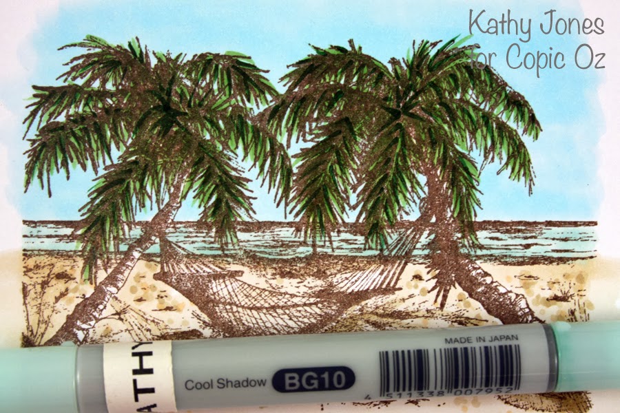
I'm using this lovely relaxing beach scene (can't you just imagine yourself here!) by Our Daily Bread Designs.  And at first you may see those palms and think how can you colour and the sky too?  The easy thing to do is colour the sky first!  I've used B000

Next take your G24 and practise using just the very tip of your marker!  This also helps you develop a light touch which is very important - a heavy hand will leave big chunky streaks of colour.  You barely need touch the paper to get neat thin lines of colour.......let the marker do the work for you!

Now use this technique to add flicks of colour over the palm trees!

Now lets add some contrast by using G28, not quite as all over as the previous layer, but enough to add interest!

Now to tone it down a bit, I've gone back over with G24.....but NOT blending!  All of this is done only with the TIP of your brush nib!

So I'm happy with the tree tops and perhaps you are thinking that's all your tips have to do.....but no, now let's colour the sand!  Colour your base using E41 (with the side of your brush nib).

Now lets add a little texture by using the TIP of your brush nib using E42 and dotting on colour.  (You could also colour an entire image with this technique, known as pointillism!)

I'm enjoying the texture and decide to add more contrast with E43.  I've also used this colour to enhance the shadows of the trees on the sand.

What about the ocean?  I've base coloured with BG10.

Then, use the TIPS of BG11 to add a few lines of colour in the ocean for waves/ripples and the tip BG72 across the horizon (the ocean always looks darkest at the horizon).

I got to the part and realised I hadn't coloured the trunks of the trees.....and yes, you can use your tips here too!!  I've base coloured with E21 and added a little blending with E23.

As most people who follow my work will know, I love contrast, so take the tip of E27 and run it down the sides of the trees where the shadows would be! (It's easy to find on this stamp as that is where the heavier lines are.)  Remember - have a LIGHT hand, practise on scratch paper if you need to!

Finish off your image!  I've used the tip of E23 to add a little colour to the hammock (couldn't do that with the side of your brush nib!) and also a little E84 for more shading on the sand and a little YG93 for the plants in the dunes.

So next time you're colouring, even though you do use the sides of your brush nib a lot - don't forget all the interesting effects you can create simply by using your TIPS!!

I hope you've enjoyed today's tutorial and whether you are by the beach this Sunday, in the pool, having a BBQ or a little backyard cricket, I hope you all have a wonderful Australia Day!

Happy Colouring!
Kathy  :)

Pin It

Wednesday, January 8, 2014

Copic Junk Journal Page

Hoping you all had a wonderful Christmas and that Santa brought you something Copic related!  Today I'm using my Copics to create and alter a Junk Journal page!  People often ask me how I deal with the bleed through from the front of the page I'm working on - onto the back of the page, when I create in my Copic Art Journal.  Well  this is one of the ways I make use of all the pages including the grubby back - just add a little collage!

To create your own Junk Journal page - you will need to gather some collage supplies - I collected some photos, the front of a Christmas card, wrapping paper, the recipe for the dessert I made and a photocopy of one of our favourite Christmas songs!


To begin, I cut the recipe and the song score to the same size as my journal pages, then I stuck a piece of the wrapping paper onto the left and right sides to create a border.  I picked one of the colours on the Christmas card and found a matching Copic Marker (V99), then using the method for Copic Stamping I stamped Snowflakes from Flourishes 'Handmade Snowflakes Set' over my background papers.


To make the background paper match the wrapping paper, I used my airbrush to add colour - I used E81 & E84 to colour the pages.


The next challenge was the photos which all had very different colours, particularly in the backgrounds.  So knowing that these were printed with Copic safe ink (these were done on a laser printer - though some ink jet printers also have Copic safe ink), I used T0, T1, T3, T5 and T7 to colour the backgrounds of each photo.  This not only made the images coordinate a little better, but it also added a little frame to the images and made the central figures stand out more.
You can see in the photo below the Copic on the left and the original background on the right, even on the first coat the grey is making the image look more interesting.


Once all the backgrounds are coloured, use fancy washi tape to stick the photos onto your pages (trim off any overhanging bits).


At this point I decided I wanted to add some journaling, but there was nowhere to write!  So I used my Molotow Marker (white 4mm) to add some journaling circles.  I applied the paint using a water marker so that some of the background peeked through.


Hmm - my pages still don't quite match - I need to find a way to bring a little of the colour from the trumpeting angel image onto the right side page.  Now I know this isn't the traditional colour for holly, but honestly it's the only Christmas image I know how to draw!  So I've used a Copic Multi Liner 0.3 to draw some holly leaves and berries onto some X-Press It Blending Card.

To colour the berries I've started by colouring the whole thing with V91.


I've added V93 - leaving the lightest spot uncoloured and a tiny strip on the bottom of the berry to look like reflected light.


Next I've added the darkest colour V99, being very careful to leave the reflected light strip uncoloured.  This darker colour is what gives the shape to the image.


I've blended the darker colour out a little with V95 - and have then added 2 more layers of each colour - being careful the whole time to leave the light spots alone, only at the very end have I gone and added another layer of V91 to blend the colours a little more.


I've added some white Molotow Paint Marker the to lightest part of the berry to add shine and have moved on to colouring the leaves.

For the leaves I've started with a base coat of  Y13.  Now these are going to be golden leaves, but it's not my usual gold colour combo as I wanted these to match the gold of the angel - which was more of an 'old' gold colour.


Then I've added Y28 - using light feathery strokes.


I've layered YR24 over the top to add contrast.


And finally Y15 on the edges to lightly blend between the Y13 and the YR24 - though I'm making sure to leave this highly textured and not actually blend the colours.    I've added 2 more layers of each colour, trying to leave the Y13 as 'bright' spots.  To finish I've added a little Gold AtYou Spica pen to the leaves.


The finished gold leaves match the angel and are very eyecatching.


Add a little journaling and doodling and the page is finished.


Products Used:
  • Copic Markers
    Background of Page: E81 & E84
    Background of Photos: T0, T1, T3, T5 & T7
    Gold Leaves - Y13, Y15, Y28 & YR24
    Berries - V91, V93, V95 & V99 and T1, T3, T5 & T7 for shadow
  • AtYou Spica Pens - Clear and Gold
  • Molotow Paint Markers - White (EF), White 4mm & Black (EF)

We would love to see what you have created over the Christmas holidays, so make sure to share on the Facebook page!

Back soon with more,
Kate
Enhanced by Zemanta
Pin It