Showing posts with label FabScraps. Show all posts

Wednesday, February 4, 2015

Monotone Journal Page - ALL Copics

Today I'm going to use my Copic products to create a monotone journal page.  Working with a limited colour palette was a new thing for me and monotones even more so!  I used my Copics to add custom colour to my embellishments and create a custom background for my page.  It took me a while to decide on an idea, but once I had, I have to confess the Copics pretty much made this so simple I was practically cheating!


You Will Need:

  • Copic Products
    Various Inks: Colorless Blender '0', E25, E59 & Black 100
    Copic Markers: Black 100, E18, E25, E47 & E59
  • X-Press It Products
    Mixed Media Journal, Double Sided Tape, Adhesive Sheets, Clear Gel Glue
  • FabScraps Products
    12x12 Paper - Australia, Journal Inserts - Love and Travel, Chipboard Die Cut - Lamps, Stencil - Stars & Vintage Mist
  • Chromacryl: Gesso Primer & Texture Paste
  • Collage items eg: ribbon, lace, leaves, material, metal findings, photos or papers

Custom Background

Step 1: Cut 12x12 paper down to a size that will fit into X-Press It Mixed Media Journal (do not glue in until finished).  Glue on Love and Travel Journal Insert pieces to add texture.  Apply a thin layer of gesso - you should still be able to see patterns from the paper underneath.  


Step 2: Apply texture paste through stencil to add more interest, wait for the paste to dry completely.  

Step 3: Copic Various Inks to Tint Gesso - Mix Various Ink (E25) into some gesso to create a tint and brush over page.  Wait until gesso is dry.

Step 4: Copic Various Inks as a Glaze - Mix Various Ink  (E59) into glazing fluid and brush over page, allow to sit for one minute then wipe off with a baby wipe.  This will allow the glaze to settle into the texture and create a grungy look.

Once dry, see how the glaze really highlights the texture!

Step 5:  Use Copic Markers ( Black 100, E25, E47 & E59) to outline elements, 

edge the page and scribble over texture.  
NB: After repeated use in this way (contact with paint and use on rough surfaces)
you will need to replace the nib on your marker.


Step 6: Fill mister with Copic Colorless Blender ('0') and spritz over the page - this will make the colours you applied run and bleed.  Allow page to dry completely,

 Once dry you can add stamping, stencilling, mists, anything you like. 


Custom Colour Embellishments

Using the same Copic colours on your embellishments as used on the background, will create a beautifully coordinated page.

Step 1: Gather all of the embellishments you will use to decorate your page, these can be metal, wood, chipboard, plastic etc. Colour the embellishments roughly with your Copic Markers (Black 100, E18, E25, E47 & E59) - leave some uncoloured space.  

Step 2: Make a pile and randomly drip on various ink (E59, E25 & 100).

Step 3: Spritz with Colorless Blender and leave to dry.


The Finishing Touch

Put it all together and glue your embellishments onto your background using Clear Gel Glue.  


You can see how the same colours of Copic ink look slightly different depending on
the material they were applied to.

I love that no matter the material - fabric, metal or chipboard, everything looks so fantastic and was so easy to colour.


My finished page looks like this... aren't those Copic colours gorgeous!


I hope this has given you some new ideas about how to use your Copic products!  Don't forget, use over paints or rough surfaces will deteriorate your nibs - so have some replacements on hand, or a few special Copic markers that you use for 'naughty' things only! 

KatePin It

Wednesday, January 7, 2015

Copic Mixed Media Journal Page

Today I will be using a few supplies from my X-Press It and Copic hoard to create a bright and happy journal page, using my 'word' for the new year!  


You will need:
  • Copic Markers: N9, N7, N5, N3, RV06, RV09, RV69 & Blender '0'
  • Copic Airbrush System
  • Copic Opaque White Paint
  • AtYou Spica Pens: Turquoise & Lavender
  • Molotow Paint Marker: Signal White EF, Shock Blue, Currant & Skin Pastel
  • X-Press It Mask It 
  • FabScraps Stencil - DS003
  • Bruynzeel Aquarel Pencils (watercolour pencils)
  • Assorted Stamps


Here's how I made it.


Gather a bold stencil, I used a pretty flower stencil from FabScraps, some favourite Copic Multi Liners for outlining and X-Press It Blending card or Blending Journal.  Using pale grey, print the word Bloom onto your page or card (for more lettering tips have a look here) using a printer.

Trace over the outline of the word with Black 0.5 Copic Multi Liner.


Place the stencil/mask at the top right corner of the page, using scrap paper to protect the rest of the area.  Use an airbrush to add RV06 all over the stencilled image.

 Swap to a darker colour, RV09 and add colour the the outside three rows of petals.

For the final colour select something even darker, I used RV69 and add colour to the outside row of petals only.

Repeat these steps, until the entire page is covered with stencilled flowers.

Use the Molotow white paint marker and Copic Opaque white to colour the printed word.
Outline letters using N9, N7, N5, N3, the greys will create a subtle outline.

At this stage you will have something a bit like this, you could leave it there,
but I had to add a little extra.

Using Memento Tuxedo Black stamp a few images onto the page (roughly mask the word with Mask It before stamping).  Use Bruynzeel Aquarel pencils to add a hint of green to the stamped leaves and black to create a shadow around the figure.  Blend with a waterbrush and let  dry.

 For a little extra pop use a Molotow paint markers to colour the skin, and also as a wash (mixed with water on a palette) to add a hint of colour to the wings.
For some sparkle add a touch of Spica - or a LOT.

Finish by adding a hint of white to the wings and leaves for contrast.

The end result looks like this - I love how the original stencil pattern recedes or pops forward depending on the placement against the stamp!


So grab those Copics and your favourite stamps and stencils and have a play!

Wishing you all a wonderful 2015 - Happy New Year!

Kate

Pin It

Wednesday, October 30, 2013

Copic Journal Cover

Hi again - today's project has quite a few steps but the results make it completely worthwhile!  Now a few of you may be familiar with the work of amazing  Polish artist Anna Dabrowska - better known as Finnabair, well today I am taking inspiration from Finnabair's unique complex style and creating a cover for my new Copic Journal.

You will need to gather some materials to embellish your journal cover: metal, plastics, embellishments, papers, lace, charms, wood, chipboard - whatever you would like to incorporate onto your design.  I am using my X-Press It Blending Journal, a variety of lace, Chromacryl white acrylic paint, chipboard shapes from FabScraps and a variety of brass charms and paper flowers.

**Normally it is recommended that you apply your Copics first BEFORE paint, pencil or any other mediums, so they won't become clogged. Before you start, you do need to be aware that when using your Copic Markers on some surfaces you need to understand the nib may become blocked by repeated use over paint and you accept that you will need to periodically replace the nib. It is a good idea to have a few Copics that you use ONLY for mixed media work.**


Paint the journal cover with the white Chromacryl acrylic paint - I used 2 coats allowing each to dry before continuing.  Once dry use the fabulous TripleTac glue from X-Press It to adhere your embellishments to the journal cover - allow this to dry thoroughly before continuing.  
This is what mine looks like.

Once dry cover everything with white Chromacryl paint and leave to dry.  You can add a little texture paste for extra interest at this point if you like.


Spray with your favourite sparkly sprays and let dry (this saves a little Copic ink as it adds a base layer of colour, it also adds a little bit of sparkle to the final project).  
Using a Copic airbrush spray BG34 over your cover to colour any light/white areas.

Spray YG25 to about 1/4 of the cover - this can either be randomly or you can choose to colour individual elements.

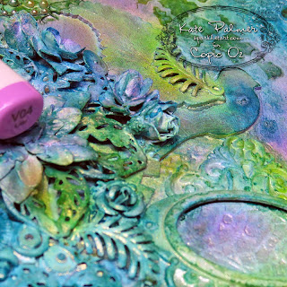
Still using your airbrush, add V04 to a few places and colour some of the elements eg: flowers or bird - this adds a beautiful contrast to the greens and blues

Add BG49 to darken the colours.

Now this is where things get really interesting!  Using the special properties of Copics and the Copic Blender you can achieve some exciting special effects.  

Before adding any final colours, use a stencil and the X-Press It Clear Gel Glue to apply a design to some of the areas without embellishment.  I also used the Clear Gel Glue to cover some individual elements to highlight them, leave this for several hours or until completely dry.

This results in gorgeous shiny areas (keep reading to see why this is an important step).


Spray BG09 around the edges of the cover - darkening the edges draws your eye to the more colourful area in the centre.  Go ahead and use your airbrush to spray right over the top of the glue design.

Add E47 to the edges and to some of the central designs, again this helps draw the eye.

The final colour E49 is only sprayed on to the very edges, and to the central frame - go ahead and spray this well, getting into all the nooks and crannies.

Use the Copic Blender for the next steps - the special effects!

Using the blender brush tip, remove the excess colour from the top of the gel glue elements (make sure to scribble to colour off your blender in between) - this will reveal the original colour underneath which is paler, creating patterns which POP!

Then use the chisel nib to remove colour from the highest points of some of the textured embellishments eg: frame, bird etc, this will reveal the colour underneath and leave yummy darker colour around it (using this flat nib ensures you only touch the very top of the design - resulting in a beautiful colour contrast - just don't press too hard!).

As a final step flick a little of the Copic Various Blending ink onto your project (I add a few drips onto my fingers and just flick this on) - this will add just a little more texture and interest to the final piece.

 Once all the colour is dry and you have finished removing colour using the Blender your project will look something like this up close, aren't those colours amazing - the Copic ink even blends and layers over paint!

and this is what my finished journal cover looks like....


Products used on this project:

  • Copic Markers: BG09, BG34, BG49, V04, YG25, E47, E49 and Colorless Blender
  • Copic Air Compressor
  • Copic Colorless Blender Various Ink
  • X-Press It: Blending Journal, Clear Gel Glue and TripleTac Glue
  • Chromacryl White Acrylic Paint
  • FabScraps chipboard shapes, lace, watch parts and other embellishments (metal and acrylic)
  • Optional - your favourite sparkly spray as a base - for a matt finish omit this


I just love the amazingly vibrant results achieved with the Copics on this project and the special effects achieved with the Blender make it just that bit more special.  I hope this inspires you to have a go at this technique for yourself, I can promise it is loads of fun and the results as you can see are fairly impressive.

I'd love to hear what you think of my journal cover,  I'd also love to see how you've decorated your Copic Journal covers so why not post a photo of your decorated X-Press It Blending Journal over on the Copic Australia Facebook page.

Kate

Pin It

Wednesday, October 31, 2012

Colour Co-ordinate Your Embellishments

I am sure we have all felt a little frustration from time to time over not having the exact matching embellishment for your work… “just the wrong shade” is too often disappointing!!  The Copic colour palette is impressive and your saviour for these situations… flowers, charms, ribbon, pearls and rhinestones are all accepting of a little make-over!

In today’s project I have focused on bringing out the pink tones in the background paper.  I originally selected the Heritage Script 3 and Floral papers from my FabScraps stash because of the little pieces of kraft poking through on the papers.  There was a strong sense of purple in the two papers I used, so to balance that I brought a good splash of pink to the lovely Magnolias by Flourishes, choosing my markers to align with the pinks in the far background.


I masked and added an additional flower and foliage to the main image so that it would sit in the corner and extend on two sides of the focal square element.  This allowed me to build square layers from the inside out, very simply with paper and kraft card.  It is easy to bring contrast and co-ordination to your layering card by applying the Copic colours used in your main image.  In this project, I used three different shades of pink, with the lightest shade on the top layer (RV21), middle on the middle layer (RV32), working back to the darkest shade (RV34).  Because you are layering the FabScraps paper on top of each kraft layer, you only need to use the thickness of the marker around each edge.  The layers are secured with X-Press It Double Sided Tape and once assembled you wouldn’t know that it is just the edges that hold colour.

FabScraps Embellishments are really versatile, and even more so when you use the colours from your main image to bring a touch more life and a good dash of co-ordination to your elements.  For this project I selected a couple of wooden buttons, white pearls in different sizes, a clear rhinestone, and a brass butterfly charm.  It’s great to have products from the same manufacturer that you can customise to suit your papers and coloured image… I added RV32 and RV34 to the pearls and rhinestone, using one coat on some and many coats on others, the more coats the more dense the colour will look.  With the metal butterfly I wanted to keep the brass undertone and applied one coat of R34 to provide a sheen of pink to this element.  The smaller of the wooden buttons was coloured first with RV32 and then I applied RV34 to the centre to provide depth.  The larger of the wooden buttons featured a bright red flower, I stripped the colour from this flower by first using a Colourless Blender and then adding colour back in with RV34.  All little touches of colour that help to both co-ordinate and add variety to your FabScraps Embellishments.

Here are the Copic Markers I used in my project today:
  • Image Flowers: 0, R000, RV21, RV32, RV34, RV69, BV29, E27
  • Image Leaves: 0, G46, YG63, YG67, E27
  • Image Stems:  YG93, YG95, E27
  • Image Shading:  B0000, BG000
  • Embellishments:  0, RV21, RV32, RV34
  • Cardstock:  RV21, RV32, RV34

I hope you enjoyed this little parade of colour, and can see the many possibilities that Copic can help you achieve when co-ordination is next a must!
Pin It