Wednesday, November 28, 2012

Colouring Reds

Hi Everyone,

Today I wanted to share a few hints with you about colouring RED with your Copic Markers.

Because red is such a highly intense colour, people often have problems colouring with it.  
More often then not, people over saturate the area, resulting in the 'bleeding out' below.


The first, and probably biggest hint I can give you is to make sure you are working on the right paper.  X-Press It Blending Card makes colouring with reds a whole lot easier!


I have stamped La La Land Craft Image:  Christmas Elf Marci onto my paper.


The reds I have chosen to use are R32,35 and 37....
 

 I always apply my lightest colour first.  Another hint ...be extra light handed.


Next I flick in my R35. 
 Notice I have started away from the edge of the image.  
This will help to not over ink the edges.


 Very lightly apply R37 from the edges in ....


Finally, go back to your R32 to blend all the reds together.

 
And there you have the perfect candy cane coloured in red!

Happy Colouring
Mandi-Lee
xxx
 

Pin It

Wednesday, November 21, 2012

A Little Birdie Told Me....

Summer is here and I've been addicted to yellows of late.  Pop over to my blog to see which "Y's" have been used here along with some pretty complimentary blues!  Find out more HERE!

Pin It

Wednesday, November 14, 2012

Colouring Metal

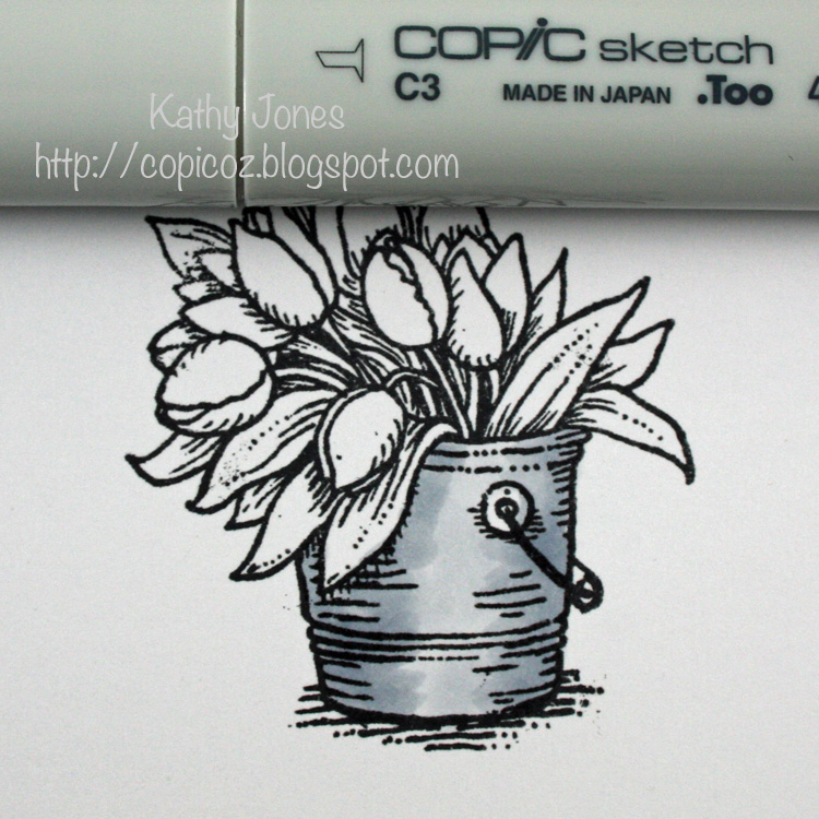
Hello Everyone and welcome to another Copic Oz Tutorial.  Today I'm showing you how I colour a metal bucket using the sweet tulip image from Flourishes' April Showers stamp set.

Colouring Metal is best achieved with the Cool Grey range of Copics because although they are grey, they also have a blue base giving it a cool, metallic feel.  To give the feeling of a rounded bucket, decide where your light source is and give your bucket a highlight (or two!) and shadowed sides.

Begin by laying down a base of C1.....


Flick in some C3 from each side, leaving a highlight area in the middle.


Flick in some C5, but not as far as the C3.


Blend with the next lightest colour, leaving the middle untouched.  To really deepen the shadows, add some C7 to the edges.

Continue to blend colours and darken edges with the above colours until you are happy with the finished look!

Finish colouring your image and make your card!!


Hope you've enjoyed today's tutorial and happy colouring!!
Kathy  :)Pin It

Tuesday, November 13, 2012

Copic Certifcation 2013

We are SOOO excited to announce the following Copic Certification dates for 2013.

Melbourne
Standard Papercraft- Sunday March 3, 2013
Intermediate Papercraft- Monday March 4, 2013

Sydney
Standard Papercraft- Saturday March 16, 2013
Intermediate Papercraft- Sunday March 17, 2013

Brisbane
Standard Papercraft- Monday June 10, 2013
Intermediate Papercraft- Tuesday June 11, 2013

Register your interest now by heading over to the Copic Website. Please note that priority will be given to Copic Stockists and their employees. However, any extra places will be opened up to public so be sure to register.Pin It

Wednesday, November 7, 2012

Copics are a Die Cut Delight

The next time you have scraps of X-Press It Blending Card put them to good use by matching them up with your Die Cuts, in this case I have matched a flower to background papers by taking perfect white blending card and colouring different layers of the flower to match the background paper.  The outer petals in 100 Black and the inner petals in R12 Light Tea Rose.


Imagine the variety of blossoms you can build by colouring your Blending Card... colour matched embellishments every time!Pin It

Wednesday, October 31, 2012

Colour Co-ordinate Your Embellishments

I am sure we have all felt a little frustration from time to time over not having the exact matching embellishment for your work… “just the wrong shade” is too often disappointing!!  The Copic colour palette is impressive and your saviour for these situations… flowers, charms, ribbon, pearls and rhinestones are all accepting of a little make-over!

In today’s project I have focused on bringing out the pink tones in the background paper.  I originally selected the Heritage Script 3 and Floral papers from my FabScraps stash because of the little pieces of kraft poking through on the papers.  There was a strong sense of purple in the two papers I used, so to balance that I brought a good splash of pink to the lovely Magnolias by Flourishes, choosing my markers to align with the pinks in the far background.


I masked and added an additional flower and foliage to the main image so that it would sit in the corner and extend on two sides of the focal square element.  This allowed me to build square layers from the inside out, very simply with paper and kraft card.  It is easy to bring contrast and co-ordination to your layering card by applying the Copic colours used in your main image.  In this project, I used three different shades of pink, with the lightest shade on the top layer (RV21), middle on the middle layer (RV32), working back to the darkest shade (RV34).  Because you are layering the FabScraps paper on top of each kraft layer, you only need to use the thickness of the marker around each edge.  The layers are secured with X-Press It Double Sided Tape and once assembled you wouldn’t know that it is just the edges that hold colour.

FabScraps Embellishments are really versatile, and even more so when you use the colours from your main image to bring a touch more life and a good dash of co-ordination to your elements.  For this project I selected a couple of wooden buttons, white pearls in different sizes, a clear rhinestone, and a brass butterfly charm.  It’s great to have products from the same manufacturer that you can customise to suit your papers and coloured image… I added RV32 and RV34 to the pearls and rhinestone, using one coat on some and many coats on others, the more coats the more dense the colour will look.  With the metal butterfly I wanted to keep the brass undertone and applied one coat of R34 to provide a sheen of pink to this element.  The smaller of the wooden buttons was coloured first with RV32 and then I applied RV34 to the centre to provide depth.  The larger of the wooden buttons featured a bright red flower, I stripped the colour from this flower by first using a Colourless Blender and then adding colour back in with RV34.  All little touches of colour that help to both co-ordinate and add variety to your FabScraps Embellishments.

Here are the Copic Markers I used in my project today:
  • Image Flowers: 0, R000, RV21, RV32, RV34, RV69, BV29, E27
  • Image Leaves: 0, G46, YG63, YG67, E27
  • Image Stems:  YG93, YG95, E27
  • Image Shading:  B0000, BG000
  • Embellishments:  0, RV21, RV32, RV34
  • Cardstock:  RV21, RV32, RV34

I hope you enjoyed this little parade of colour, and can see the many possibilities that Copic can help you achieve when co-ordination is next a must!
Pin It

Tuesday, October 30, 2012

THINK PINK WINNER!!!

Oh My Goodness!!!  The response to our Think Pink Challenge was absolutely AMAZING!!!!  There were 125 incredible entries, all skill levels, styles, themes and designs.....truly a wonderful array of eye candy and all in glorious PINK!!!!  We have been blown away by the support shown and thanks to all of you amazing crafty ladies, we are thrilled to announce that we have raised $1250 for the McGrath Foundation!!!!  By making a pink card, each one of you have helped make a difference in the life of someone affected with Breast Cancer!  THANK YOU!

So I'm sure you're all waiting for the winner!!!  We are happy to announce that the winner of the fabulous prize pack is........NUMBER 86 TEREESA C!!!!

Congratulations!!!!  You've won a prize pack containing - Flourishes Think Pink Stamp Set, an Acrylic Block and a Pack of X-press It Blending Card!  Please send an email to Sascha with the Subject: THINK PINK Winner. We will post your goodies off to you ASAP!


Once again, a HUGE thank you to everyone who entered the Think Pink Challenge, each card resulted in a $10 donation to the McGrath Foundation thanks to X-press Graph-x!
Pin It