Showing posts with label Art. Show all posts

Wednesday, August 26, 2015

Copic Various Inks

Goodmorning Copic fans, today we are looking at Copic Various Inks.  Various Ink refills are part of what make the Copic system truly amazing. All 358 marker colors have a matching bottle of ink. Each bottle will fill a dry marker up to 15 times, depending on the style of marker. Each bottle of ink has a built in dropper tip for simple application. The airtight inner seal prevents the alcohol ink from drying out for many years.  Now while it's true their intended purpose is to refill your markers (Kathy discussed this in the last post),  they are an amazing art supply all by themselves, incredibly versatile and perfect for creating alcohol ink based art projects.  Today we are looking at using Copic Various inks in 2 different ways, allowing you to incorporate more inky fun into your cards, pages, canvas or scrapbooking layouts.

22176-6130-3ww-l


Materials


  • Copic Various Inks: V15, BV04, RV19, V06, R35, RV32, Y38, YR04 & YG01
  • Copic Colorless Blender
  • Copic Multi Liner in 0.3 & 0.5
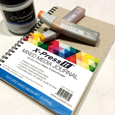
  • X-Press It Mixed Media Journal
  • Kirarina Wink Pens - Precious Set 
  • Chromacryl Gesso
  • Paint Palette, brush & mister


Instructions

Step 1
Begin by preparing a page in your X-Press It Mixed Media Journal with gesso.  If you would like a white background paint the page with white gesso, if you would like a coloured background, then add a few drops of Various Ink to your gesso to create a tint.  Wait for the gesso to dry before moving to step 2.  Painting the page with gesso seals the paper and will allow the Various ink to move around more.  This example uses YG01 and Y38 to tint the gesso.


Step 2
Add one drop of Various Ink onto your background, because the paper has been sealed, the ink will spread and wick forming a circular shape.  This example uses R35 as the first colour.  For larger circles add a second or even a third drop of ink.  One drop goes quite a long way.


Step 3
To create some variation add a single drop of Various Ink - Colorless Blender to the center of each circle.  This will create a paler area in the middle.


Step 4
To create a more interesting looking circle add a single drop of a different colour to the center.  This example uses Y38.  You may notice that a single drop of any colour travels almost the same distance over the gesso!


Step 5
To create smaller circles, add 3 drops of colour and 2 drops of Colorless blender to a plastic surface, mix together and apply using an old paint brush.  Adding a smaller amount of liquid/ink results in a smaller circle!  You can use the brush to create smaller flowers, flower centers or add little drops of colour to the background.

Repeat Steps 2-5 using a variety of Copic Various Ink colours, until you have almost covered your background.  This example uses: V15, BV04, RV19, V06, R35, RV32, Y38 & YR04

Step 6
Add a little Various Ink - Colorless Blender to a small mister and lightly spray the Colorless Blender from a distance of about 15cm over your circles - this will create random spots and create pattern and interest.

Step 7
Use black Copic Multi Liners 0.3 & 0.5 to add a doodled designs and embellish your circles.  I made my circles look like flowers by adding lines to resemble petals.


Step 8
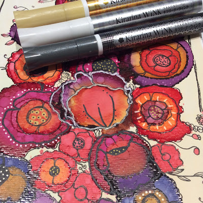
Use Kirarina Wink pens from the Precious Metals set to add touches of pearl and metal to your design - once dry you can draw over the ink with your Copic Multi Liners for extra detail.  I love how these look over the Copic Various Inks - it really brings the page to life.


This is some of the ink pattern and doodling up close - the Various Inks give the most amazing concentrated colour to your projects.


and the finished project looks like this, a little wild and chaotic, but so much fun to create.


So grab your Various Inks and use them on your next project - they're not just great for refilling your markers, but are fabulous all on their own.

Back with more next month,

KatePin It

Wednesday, February 4, 2015

Monotone Journal Page - ALL Copics

Today I'm going to use my Copic products to create a monotone journal page.  Working with a limited colour palette was a new thing for me and monotones even more so!  I used my Copics to add custom colour to my embellishments and create a custom background for my page.  It took me a while to decide on an idea, but once I had, I have to confess the Copics pretty much made this so simple I was practically cheating!


You Will Need:

  • Copic Products
    Various Inks: Colorless Blender '0', E25, E59 & Black 100
    Copic Markers: Black 100, E18, E25, E47 & E59
  • X-Press It Products
    Mixed Media Journal, Double Sided Tape, Adhesive Sheets, Clear Gel Glue
  • FabScraps Products
    12x12 Paper - Australia, Journal Inserts - Love and Travel, Chipboard Die Cut - Lamps, Stencil - Stars & Vintage Mist
  • Chromacryl: Gesso Primer & Texture Paste
  • Collage items eg: ribbon, lace, leaves, material, metal findings, photos or papers

Custom Background

Step 1: Cut 12x12 paper down to a size that will fit into X-Press It Mixed Media Journal (do not glue in until finished).  Glue on Love and Travel Journal Insert pieces to add texture.  Apply a thin layer of gesso - you should still be able to see patterns from the paper underneath.  


Step 2: Apply texture paste through stencil to add more interest, wait for the paste to dry completely.  

Step 3: Copic Various Inks to Tint Gesso - Mix Various Ink (E25) into some gesso to create a tint and brush over page.  Wait until gesso is dry.

Step 4: Copic Various Inks as a Glaze - Mix Various Ink  (E59) into glazing fluid and brush over page, allow to sit for one minute then wipe off with a baby wipe.  This will allow the glaze to settle into the texture and create a grungy look.

Once dry, see how the glaze really highlights the texture!

Step 5:  Use Copic Markers ( Black 100, E25, E47 & E59) to outline elements, 

edge the page and scribble over texture.  
NB: After repeated use in this way (contact with paint and use on rough surfaces)
you will need to replace the nib on your marker.


Step 6: Fill mister with Copic Colorless Blender ('0') and spritz over the page - this will make the colours you applied run and bleed.  Allow page to dry completely,

 Once dry you can add stamping, stencilling, mists, anything you like. 


Custom Colour Embellishments

Using the same Copic colours on your embellishments as used on the background, will create a beautifully coordinated page.

Step 1: Gather all of the embellishments you will use to decorate your page, these can be metal, wood, chipboard, plastic etc. Colour the embellishments roughly with your Copic Markers (Black 100, E18, E25, E47 & E59) - leave some uncoloured space.  

Step 2: Make a pile and randomly drip on various ink (E59, E25 & 100).

Step 3: Spritz with Colorless Blender and leave to dry.


The Finishing Touch

Put it all together and glue your embellishments onto your background using Clear Gel Glue.  


You can see how the same colours of Copic ink look slightly different depending on
the material they were applied to.

I love that no matter the material - fabric, metal or chipboard, everything looks so fantastic and was so easy to colour.


My finished page looks like this... aren't those Copic colours gorgeous!


I hope this has given you some new ideas about how to use your Copic products!  Don't forget, use over paints or rough surfaces will deteriorate your nibs - so have some replacements on hand, or a few special Copic markers that you use for 'naughty' things only! 

KatePin It

Wednesday, September 10, 2014

Layering Copic Colours to Create a Beautiful Night Sky Effect

I'm back this week with another idea with many uses - layering your Copic colours, for a beautiful though abstract result.  I often hear Copic beginners expressing their frustration with learning to blend, well while you are mastering blending why not play with layering.  Layering colours is much easier, gives interesting and unexpected results and can be used on many projects.  I have used this to create a journal page, but you could easily use this as an amazing way to colour clothing on a stamped image, create a beautiful name tag, a stunning background or anything else you can think of!

For this page I have used:
  • X-Press It Blending Journal
  • Copic Markers: Colorless Blender '0', N0, N1, N3, BG11, B13,  B69, B79, RV06, RV09, BG94, B97 & B99
  • Molotow Extra Fine Paint Marker

 To create this page:

Start by stamping, printing or writing onto the lower right of your page.


Using very pale Neutral Grey (or Cool Grey) colours roughly draw the outline of a hole onto your page.  This will be used as a guide for the final step so don't spend too much time on this.


Next add BG11 and BG13 and blend slightly - just enough so the colours look smooth.


Add B69 and then darken using B79.
Where the B69 borders the BG11 or BG13, pounce the BG11 over the darker colour - this will make the darker blues go a little mottled and cloudy and add some of the aqua into the blue.


Add a hint of RV06 and darken with RV09.
Where the Cerise borders the blue, layer RV09 over the blue, while these colours will not blend, a little of the Fuchsia will be introduced into the blue.  In doing this, you are introducing a hint of one colour into another - your finished result will be much nicer.


Then use BG49 to add a little more depth - I have used it to create something of a pattern.


Darken the image by layering B97 and B99, both over and around the existing colours.  I've also used these to outline my 'hole' in the paper.


Continue to add more layers (using the method of pouncing one colour over another where 2 dissimilar colours meet) and fill in any pale spots with the colours you have already used.  I have tried to create patterns that look vaguely cloudlike (you could refer to photos of the night sky for ideas if you like).
To finish I have used B79 and B99 to add fine lines and outlines to some of the patterns.


Flick paint from the tip of a Molotow Paint marker over your coloured image and carefully draw some starbursts.  Leave to dry.


See how the white paint really makes the colours 'pop'.


To finish the page scrunch up some paper, tear a hole to match what you have drawn  (this is a tiny bit fiddly) and roll back the edges of the paper around the hole.  To make sure this stays exactly as is, glue down the rolled paper pieces.


Between the starkness of the white page and the depth of colour, this really leaps out at you.  This is a really simple way to use colours that don't naturally go together, just remember to keep layering until you are happy with the result and pounce one colour over another so that there are no harsh edges.

Hoping you all have a wonderfully creative week,
KatePin It

Wednesday, July 16, 2014

Doodling Over Printed Images with Copics

I thought that for today's post I'd give all of the nervous doodlers out there a hand and show you a straightforward project that looks stunning!  You can complete this page with just a few materials and with only a little experience and imagination.  Now this is quite a step-by-step project so grab your Copics and let's get started, because we are going to be creating this masked lady!


You Will Need:

  • Copic Multi Liners in 1.0, 0.5 and 0.3 
  • Copic Markers: 0 (Colorless Blender), C1, C3, BV0000, BV000, Y26, E47, E49, E00, E11, E21 and E23
  • Copic Airbrush (optional)
  • X-Press It Blending Journal or Blending Card
  • Magazine Image - Photocopied or Laser printed in black and white
    (ink jet printed images will not be suitable unless the ink in your printer is Copic safe)
  • Tracing paper
  • Soft lead pencil
  • Favourite Stencils or masks

Instructions:

Copy or print a black and white portrait onto Blending Card.  For mine I have scanned an image from a magazine advertisement and using a black and white laser printer, I have printed this directly onto a page in my Blending Journal.  You could also print onto a piece of Blending card and glue this into your journal later.  If you are a little more adventurous you could draw your own image or even use a face stencil as the basis for this technique.


Using your Multi Liner 1.0 outline the major facial features - you are aiming for a comic book style outline for this step.  Colour in and dark areas (nostrils and inside mouth) for a dramatic look.


Lay tracing paper over the face and plan a simple mask - the tracing paper allows you to draw and re-draw the mask until you are happy with it.  Once satisfied with your mask design, trace the image onto your face in pencil.  Go over the pencil with Copic Multi Liner and erase all signs of pencil marks once the ink is dry.  If not sure what to draw, Google filigree masks for interesting ideas.


Grab some of your favourite stencils and add stencilled designs to your image, you may like to use these on the hair, the mask or even the face!  You may like to draw outlines only or use the images to add design elements eg: a birdcage ear-ring!


Add as much or as little doodling as you like.  If you have a look at mine below you will notice I've used lots of repeating patterns and have varied the width of my lines for some added drama and to really draw the attention to the eyes.

Doodled Portrait

You can leave it like this or you can be brave and add a little colour - if you are nervous about ruining your art then either take a photo or scan your image, you can always print the black and white image onto card and start again!  If you have an airbrush this is a very quick way to colour the base layer of skin on large images (which is what I've done using E00, E11 & E21) you can also do this by hand if you don't have an airbrush.  Either way add as little ink as possible - you only want the skin to have a hint of colour.

Use E00 to add a base layer of colour to the skin - I added an even layer all over the face and neck.  You might be able to see that I had cut a mask to go around the face and protect the background and hair - this made sure my airbrush work stayed clean and crisp.


Be guided by the shadows on the image and add E21 to these shadowed areas.


Finish colouring the skin by adding E11 into the shadows for a little extra depth, I've also added a little extra around the jaw and hairline.  If you are using a mask - you can remove it at this point.


Using BV0000, BV000, Y26, E49 and E47 - carefully colour the eyes - these are the focal point of the whole page so pay attention and colour carefully.


Add some grey to the mask to distinguish it from the face - just a little and keep it light.
I used C1 and C3 - blend with a little E00 if it begins to look a little too grey.


 As a final touch add E23 and E21 to the pattern on the neck and as shading around the eyes - really amp up the colour near the eyes.


You can immediately see that by colouring the eye area more heavily than the rest of the image, it really focusses your attention.  I've intentionally left the hair and background uncoloured to enhance the look of the face.  By keeping the colours to a minimum and using what is essentially a monochrome palette, I think it produces a softer look that is still appealing.


So while at first glance this project may look difficult and complicated, by taking things step-by-step I think this is something anyone can try!

Back with more soon,
Kate

PS- Make sure you pop back tomorrow morning to see if you were one of our lucky blog hop winners!!Pin It