
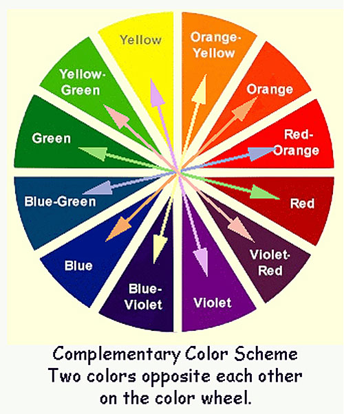
Colors that are opposite each other on the color wheel are considered to be complementary
colors (example: red and green).

The high contrast of complementary colors creates a vibrant look especially when used at full saturation. This color scheme must be managed well so it is not overpowering or uncomfortable to the eye.
Complementary color schemes can be tricky to use in large doses, but work well when you want something to stand out.
Complementary Colours also work perfectly in your shadow work. Be bold and brave and give it a go...add some R59 or R89 to shade your green trees! You will be very pleasantly surprised by the outcome!
Here are two exaples of images that have been coloured using complementary colours.

Red and Green ( I have also used G29 to add some shadow into her dress!Yes thats right....G29)

Purple and Yellow/Orange
So....this brings me to the challenge.....
What's the Challenge?: Create a project (card, layout, off the page) using your Copic Markers to show us your best complementary colour creations!
Is there a Prize?: YES!! This month the prize is a copy of the SHADOWS and SHADING BOOK.

Who can play?: The challenge is open to EVERYONE, including international!!!
How do you enter?:
Use the inlinkz below to connect to your blog or online gallery
and upload it prior to 6pm Monday 24th October 2011, Australian EST
(4am USA EST)!!! The winner will be announced on Tuesday 25th October 2011.
Happy Colouring....Mandi-lee
xxx
xxx