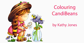
Here is Izzy stamped in Memento Tuxedo Black onto X-press It Blending Card. With Standard Colouring, we teach you to find a colour you like and then a 'friend' to go with in. Usually this means, find a colour, look at the number and then find another marker with the Same Letter, Same First Number and the Second Number 2 - 4 digits apart. Always start with your LIGHTEST colour! Here I've used E000 and E01 for her skin.
For her hair I've used YR21 and YR23 (a colour 2 digits away from the original colour)
Once again, using two colours, E23 and E25.
Continue colouring using pairs of markers to complete your image and she'll look a little something like this.....
Other colours used here are....
Dress - R81, R83; Y11, Y15
Flowers - V20, V22
Greenery - YG03, YG63
Vase - B0000; Y21, Y26
Now she's looking lovely, but what if you wanted to step it up a bit?? Why not take your image and place a piece of acetate over the top with diagonal lines drawn on it. Imagine this is your light source. Where the lines hit first (on the image) will be where your highlights are (also imagine that she's not flat, so it will hit the rounded parts of her hat and dress too). The areas further away will be in the shadow and therefore darker.
Using this template as a guide, start colouring your image! I've begun with her hat using E21
And E23
And E25
And E27
And for even darker shading, E79. The more contrast, the more interest and dynamic your image will be!
Next start on her hair! I've started with YR23.
And E99 (Colouring hair is perfect for breaking the colour rules and mixing colour families and numbers since hair is made up of so many colours!)
Add some E18
And E39
Now lets look at skin, remember that we are imaging that our light source is coming from the top right side! I've laid down my base colour of E000.
Then added some shading under her fringe on on the left side of her face, arms and legs with E01.
So far we've done exactly the same colours as in the standard colouring at the start of the post, so lets see what some more contrast will do! Add some E11!
Add more shading with E13 and lightly blend your colours using E11, then E01 and E000.
Keep colouring your image....
Dress - R81, R83, R85; Y11, Y15, Y17
Flowers - V20, V22, V25
Greenery - YG03, YG63, YG67
Vase - B0000, BV31; Y21, Y26, Y28
Bee - N5, N7; Y11, Y15
Let's compare....
So what do you think of the differences by adding a distinct light source and use of stronger contrast with more colours?? So much fun!
Hope you've enjoyed today's tutorial and hope you try adding more shading and contrast to you images for exciting, dynamic results!
Happy Colouring!
Kathy


